One Simple Way To Be More Mobile Friendly
I know there is a 500 word article in me to explain this one simple way to be more mobile friendly. Chances are it’s filled with witty lines, bad grammar and too many commas. However, I don’t want my long-windedness to distract you from the simplicity of my point. Plus, I like the idea of calling this tip “simple” and writing a simple article. Ready…
Do not put your contact information in an image.
That’s it.
If you respect this simple rule, mobile users everywhere will appreciate your mobile friendliness.
If you know what I’m talking about, no need to continue reading. The rest of this article is for those that need a little more explanation.
I see this rule violation most in branded email signatures and website headers. It usually happens when the marketing person knows how to make graphics look a certain way, but isn’t sure how to write the HTML code to match. I admit, I’m a fan of function. Of course having it branded and functional is best, but if you have to choose one or the other – go with function.
Quick example:
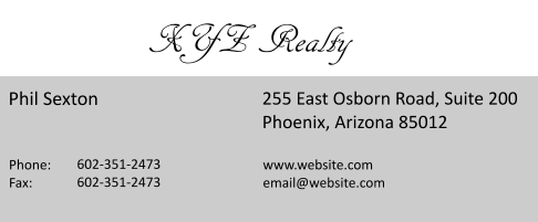
I work at XYZ Realty and we have a meeting at my office. You’re running five minutes late and didn’t have time to map the location. You jump in the car and hit the road towards the general area that you know you’re going. At the first red light, you pull up the last email I sent you to get the address from my email signature and this is what you find:

You click the address to open the mapping app. Nothing. You click the phone number to call me. Nothing. The light turns green. You start reading the address out loud so you can remember it long enough to speak it to Siri. People start honking.
However, if your signature was a little more mobile-friendly it would look like this…
XYZ Realty
Phil Sexton
255 East Osborn Road, Suite 200
Phoenix, Arizona 85012
602-555-1212
website.com
email@website.com
Your phone may automatically make the address and/or phone number clickable. At the minimum, you can copy/paste it. I know it’s not as fancy, but it’s functional. Mobile users rejoice, which we like.
Now, who wants to take it one step further?
Tags: branding, email signature, mapping, mobile, mobile friendly